List components #31
 jare2473
 ansv7779
Loading…
x
Reference in New Issue
Block a user
No description provided.
Delete Branch "list_item"
Deleting a branch is permanent. Although the deleted branch may continue to exist for a short time before it actually gets removed, it CANNOT be undone in most cases. Continue?
This PR contains multiple related components.
Addresses issues #18 #19 #20 #21 #22
Issue: The colors defined in ListCard (https://www.figma.com/design/zFYdCdtEqACZmWwfnNRNY1/Studentportalen?node-id=2591-4546) are not accurate.
Can be viewed on:
https://studentportalen-listitem.branch.dsv.su.se/
Should be fixed now.
Comments on the Combobox (#20):
The tab/focus/keyboard-navigation should behave like this example: https://www.w3.org/WAI/ARIA/apg/patterns/combobox/examples/combobox-autocomplete-list/
Main takes:
Other things:
Missed a few things. Should be fixed for real now. The implemented component needs to be updated
Participant picker
I have updated the List Item overview and Search results
Other than that, it looks great!
Great! But just one small thing: when navigating the list with keyboard, a selected item should also get the "focus/hover"-state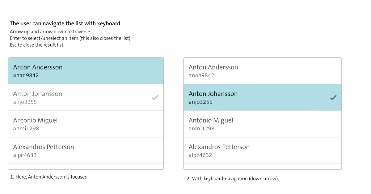
Also found a bug! If starting with keyboard navigation and then using mouse (or vice versa), the list gets two separate "focus"-states - one for the mouse, one for the keyboard. The list should only have one focused element at a time.

Fixed.
This isn't a bug, browsers allow one element to be focused (keyboard) while another is hovered (mouse). Since our hover and focus-visible styles are the same, it creates the appearance of two 'active' items. That is expected behavior.
706b9d2c3ctof0ba8fe1a4@ -0,0 +23,4 @@noResultsText?: string;multiple?: boolean;value?: string | string[];onChange?: (value: string | string[]) => void;I think this component would have been better split into two, a single select and a multiple select version. If I use it with
multiple={false}I would not want myonChangecallback to be called with an array of choices.@ -0,0 +3,4 @@import ListItem from "../ListItem/ListItem";export interface SearchResultOption {value: string;This is limiting. Often times you want to select some more complex object as you do in your examples in
ComponentLibrary. Forcing all users of the component to do their own lookup when it should be handled by theCombobox/this component.